How We Built /think-tank — A Skill for Infographics That Can't Lie
June 18, 2026
By Erik Bethke · also on erikbethke.com
It started with a water drop that refused to lie.
My friend and colleague Michael Conard wrote a rigorous, data-backed field guide arguing that the panic over AI's water use is mostly a measurement error — the viral “a bottle of water per email” claim is wrong by about a hundredfold. I wanted to give it a home on my blog, and I wanted to do it justice. So I asked Claude Code to read the piece deeply and generate ten hero images.
The first ten were… perfectly competent. Not slop — decent, polished, professional-looking AI-gen images, the kind you scroll past a hundred times a day without a flicker of memory. Dawn over an infinite data-center horizon. A glowing closed-loop cooling pipe. A cathedral of server racks. Technically clean, compositionally sound, and every single one mentally boring — the visual equivalent of elevator music. I rejected most of them on sight.
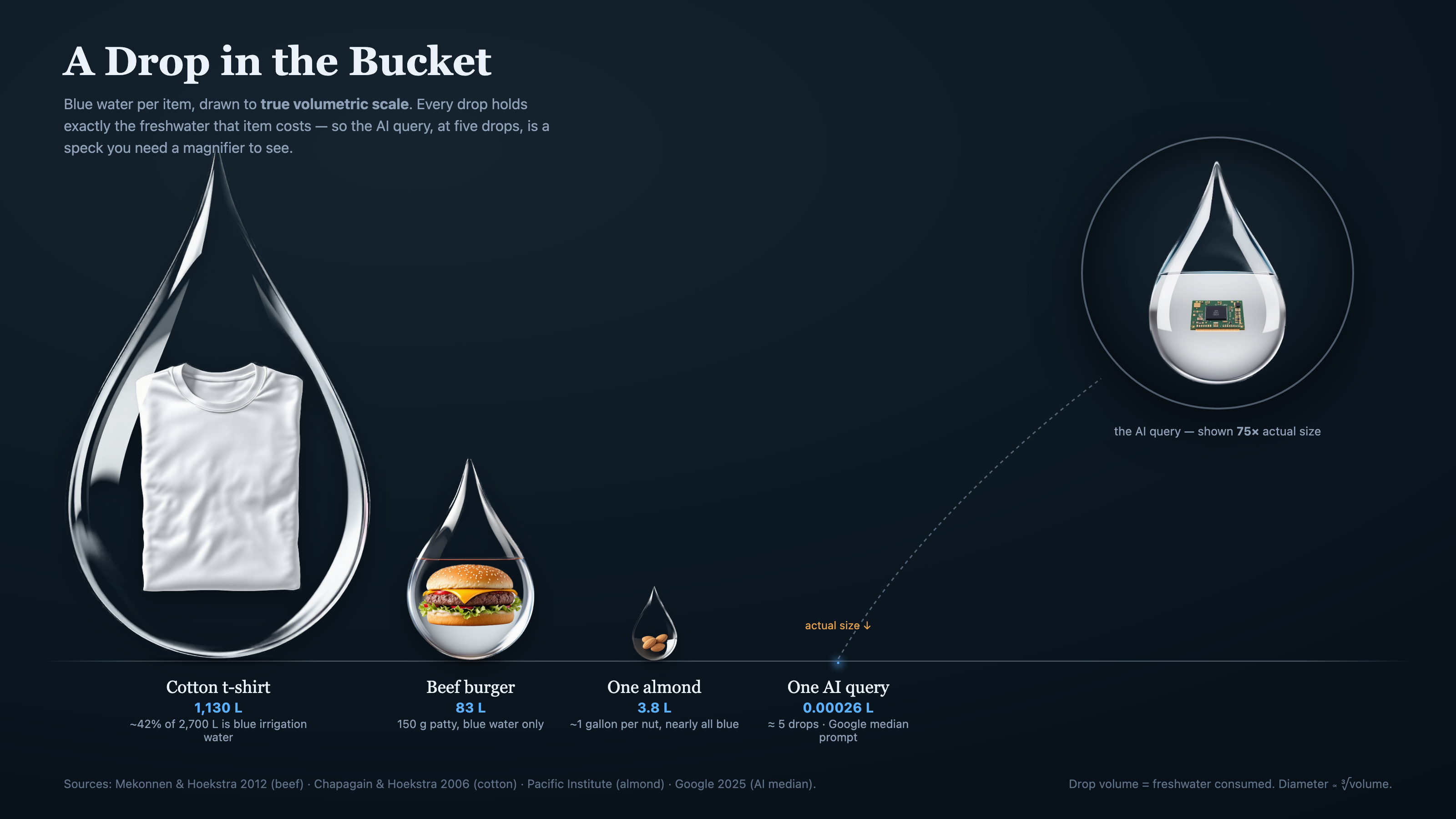
But one was different. It wasn't a mood; it was an argument. A row of everyday objects — a burger, a t-shirt, some almonds — each encased in the water it actually costs, next to a single AI query so small you could barely see it. It had crossed the line from decoration into information. That was the one worth chasing. And chasing it turned a one-off image into a reusable Claude Code skill we now call /think-tank.
This is the story of what it is, how it works, and how we built it — because I think the idea generalizes far beyond one article about water.
The idea: an exhibit, not an illustration
A think-tank exhibit is a data graphic in the visual register of a serious shop — The Economist, Our World in Data, Pew, RAND, a Futurum field guide. The point isn't to set a vibe. The point is to size the thing correctly, which is usually the whole reason the piece exists.
What makes it righteous — and that was the word I used when I first saw it land — is that it is honest by construction. The picture cannot lie. If something looks ten times bigger, it is ten times bigger. That sounds obvious until you realize almost no infographic on the internet actually works that way; most of them are drawn by eye, or by a diffusion model guessing at proportions, and the numbers are decorative.
We baked that honesty into five hard rules. They are the difference between a think-tank exhibit and a pretty chart:
- The geometry is the data. Every size is computed from the real number in code. The image generator makes the objects; math makes the sizes. No eyeballing.
- Pick the scale that tells the truth — and disclose it. Linear only works when the range is small. When it isn't, choose a volumetric (cube-root) or logarithmic scale on purpose, and print the rule right on the canvas.
- When the truth is hard to draw, draw it anyway. In our water piece the AI query is four million times smaller than a cotton t-shirt. At an honest scale it becomes a literal two-pixel speck — invisible. That vanishing is the finding. So we kept it tiny and added a magnifier loupe (shown at 80×) to reveal the GPU chip inside. The dishonest move would have been to inflate it to a “readable” size. That is the exact lie the exhibit exists to refute.
- Cite your sources on the canvas. Every number names the study behind it.
- Order and membership must be honest. Sort by true magnitude even when it surprises you. (It turns out a cotton t-shirt is thirstier than a burger.) And drop any item that isn't apples-to-apples — we cut golf, because the article only had it as an annual aggregate, not a per-item number. Including it to round out the picture would have been the precise sin the genre opposes.
The five drops are cheap. The honest question is whether what they produce is worth more than five drops. The graphic's only job is to let you ask that question without being lied to first.
How it works
The skill is a pipeline, and the most important step happens before any pixels exist.
| Step | What happens |
|---|---|
| 1. Extract & decide | Pull the real numbers and their sources out of the source material. Choose the unit, the scale, the sort order, and which items are honestly comparable. This thinking is 80% of the skill. |
| 2. Generate “pucks” | One clean image per item — a subject suspended inside a vessel that represents the quantity (a water drop, a barrel, a stack of coins). We use the Bike4Mind flux-pro API on a flat background so the next step is clean. |
| 3. Cut to alpha | Background removal (rembg) cuts each puck to a transparent PNG and crops it tight. |
| 4. Compose | A small HTML/SVG template reads a spec.json and computes every diameter from the real number, lays out the row with no label collisions, and places the magnifier. |
| 5. Render | Headless Chrome renders it to a retina PNG — and because it's just HTML, the same file drops straight into a blog post with no surgery. |
The heart of it is that spec.json. It is the entire exhibit as data — and notice there are no pixel sizes in it, only real-world values:
{
  "title": "A Drop in the Bucket",
  "scale": "cbrt",
  "items": [
    { "name": "Cotton t-shirt", "value": 1130, "vfmt": "1,130 L", "file": "puck-tshirt.png" },
    { "name": "Beef burger",    "value": 83,   "vfmt": "83 L",    "file": "puck-burger.png" },
    { "name": "One almond",     "value": 3.8,  "vfmt": "3.8 L",   "file": "puck-almond.png" },
    { "name": "One AI query",   "value": 0.00026, "vfmt": "0.00026 L", "file": "puck-gpu.png" }
  ],
  "loupe": { "item": -1, "factor": 80 },
  "scaleNote": "Drop volume = freshwater consumed. Diameter is proportional to the cube root of volume."
}
You give it values; it computes the geometry. That is the whole trick, and the whole integrity.
How we built it
We built it the way you should build any tool: we solved the real problem first, by hand, and only then extracted the reusable thing.
The first version was a one-off for Michael's article. I gave Claude feedback the way I would give a designer notes — the almonds read badly sitting on grass; use a golf ball, not turf; the labels are colliding; the magnifier text is clipped. We iterated until it was right, and the moment it clicked I asked the real question: is this a skill?
It was. So we generalized the one-off into a parametric template, wrote down the five rules as the skill's spine, and proved it by rebuilding the exact same approved image from a clean spec file. Same output, now reproducible for any comparison.
Two things from that build are worth calling out, because they are the difference between a demo and a tool:
- Michael QA'd it and found two flaws — colliding labels and a clipped caption. We fixed them in the template, not just in the one image, so every future exhibit inherits the fix. A bug found by a real user is a gift; fix it at the root.
- The hero got cropped on the live blog. My post template renders the lead image in a fixed banner band, and a tall square-ish exhibit got its data guillotined off the bottom. The fix wasn't to fight the template — it was to teach the skill to also emit a wide banner edition tuned to the band, while the full exhibit lives in the article body. That recipe is now baked in too.
That is the pattern I care about: the skill doesn't just encode how to make the thing. It encodes everything we learned the hard way about making it correctly — the honest-scale judgment, the sub-pixel loupe trick, the no-orphan-labels layout, the banner crop. The next exhibit starts from all of it for free.
Why this matters to us
We make a lot of arguments with numbers, across a lot of properties. The cheapest way to lose trust is to illustrate a careful argument with a careless chart. /think-tank is a small insurance policy against that: a way to make graphics that are premium and true, where the design serves the data instead of the other way around.
It is also a template for how I want us to build tools generally. Solve the real thing first. Take the feedback seriously. Then ask whether the thing you just made by hand wants to be a machine — and if it does, encode not just the steps but the taste. The judgment is the asset.
The water drop that refused to lie is now a skill that refuses to let us lie. I'll take that trade every time.
— Built with Claude Code. The first exhibit lives at the top of Michael Conard's “Reports of AI's Thirst Have Been Greatly Exaggerated.”